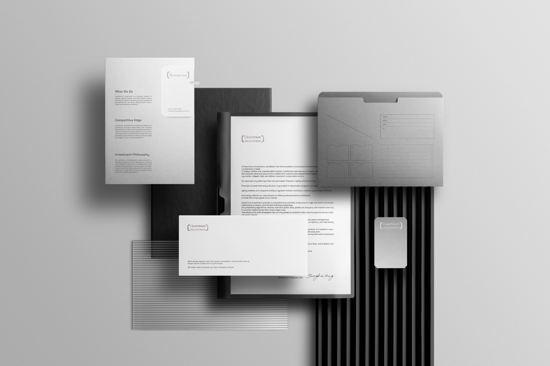
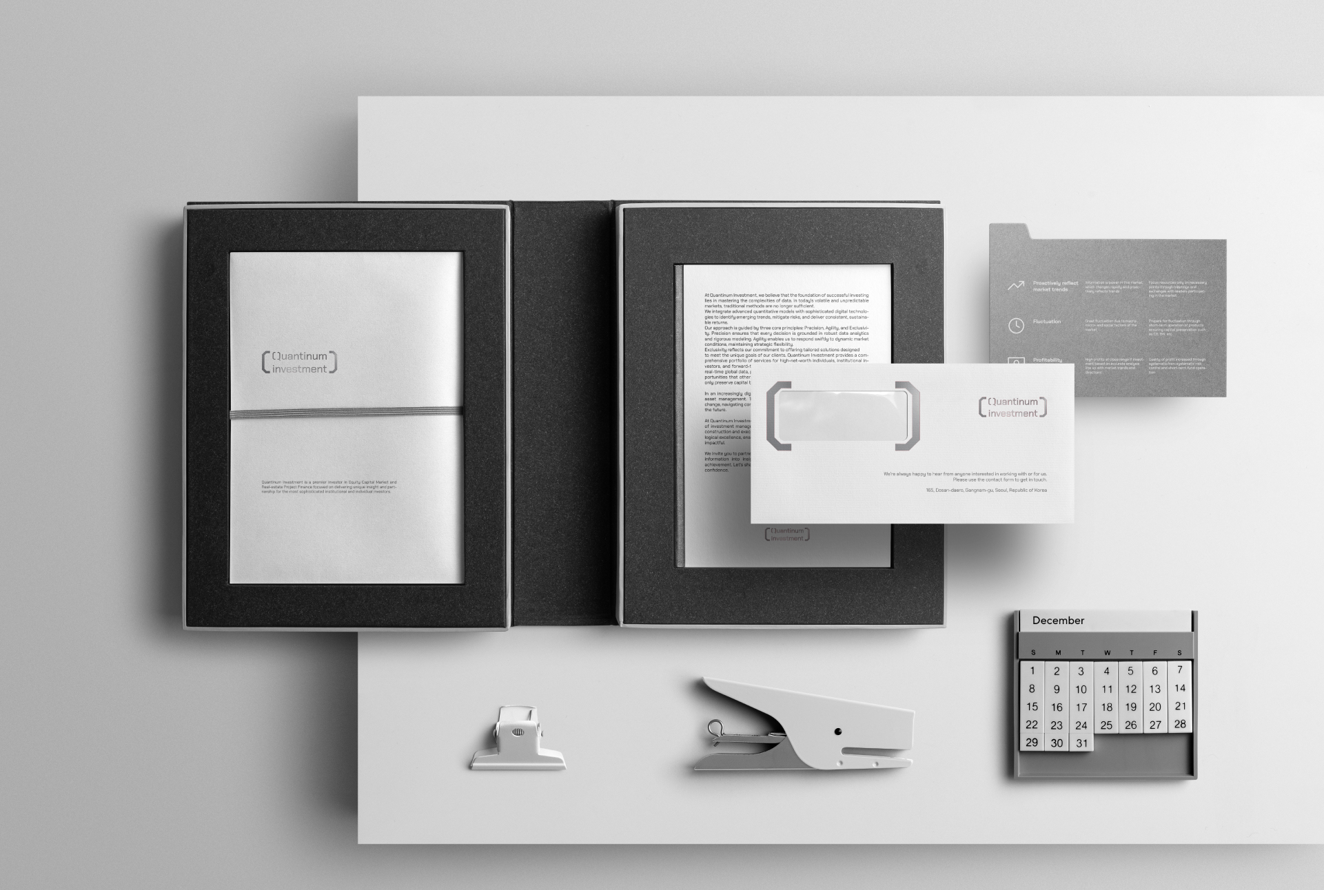
Quantinum Investment is a next-generation asset management company that builds investment strategies based on data-driven quantitative analysis. True to its name, combining “Quantitative” and “Platinum”, the brand pursues both precision and rare value. It aims to navigate complex, rapidly changing markets by identifying opportunities through data-driven insights. In an increasingly digital financial landscape, Quantinum Investment needed to move beyond traditional and analog imagery. We redefined the brand’s visual identity around three core themes: precision, digital thinking, and exclusivity.

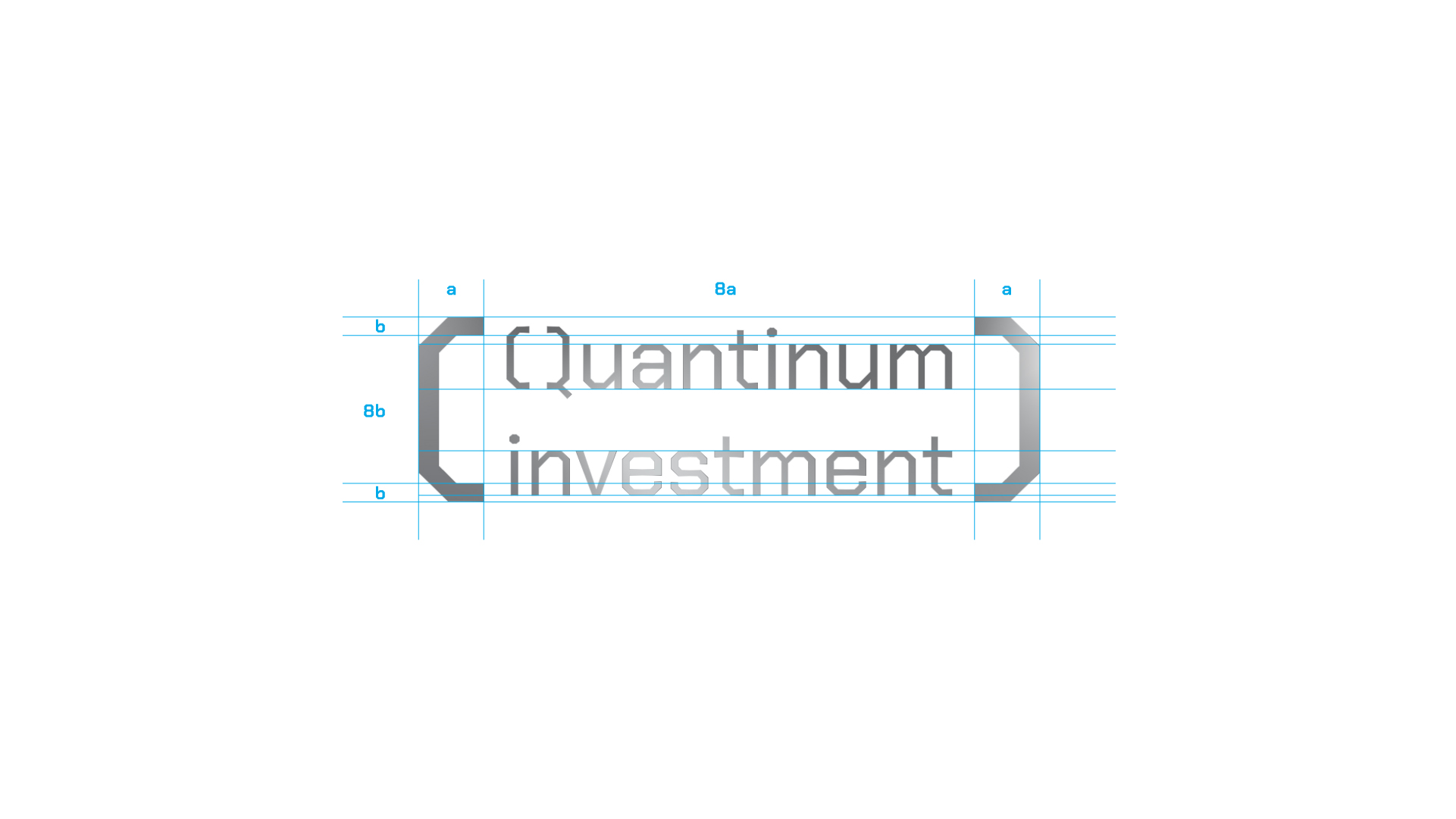


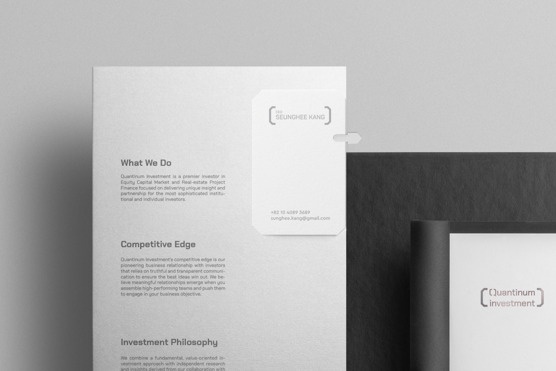
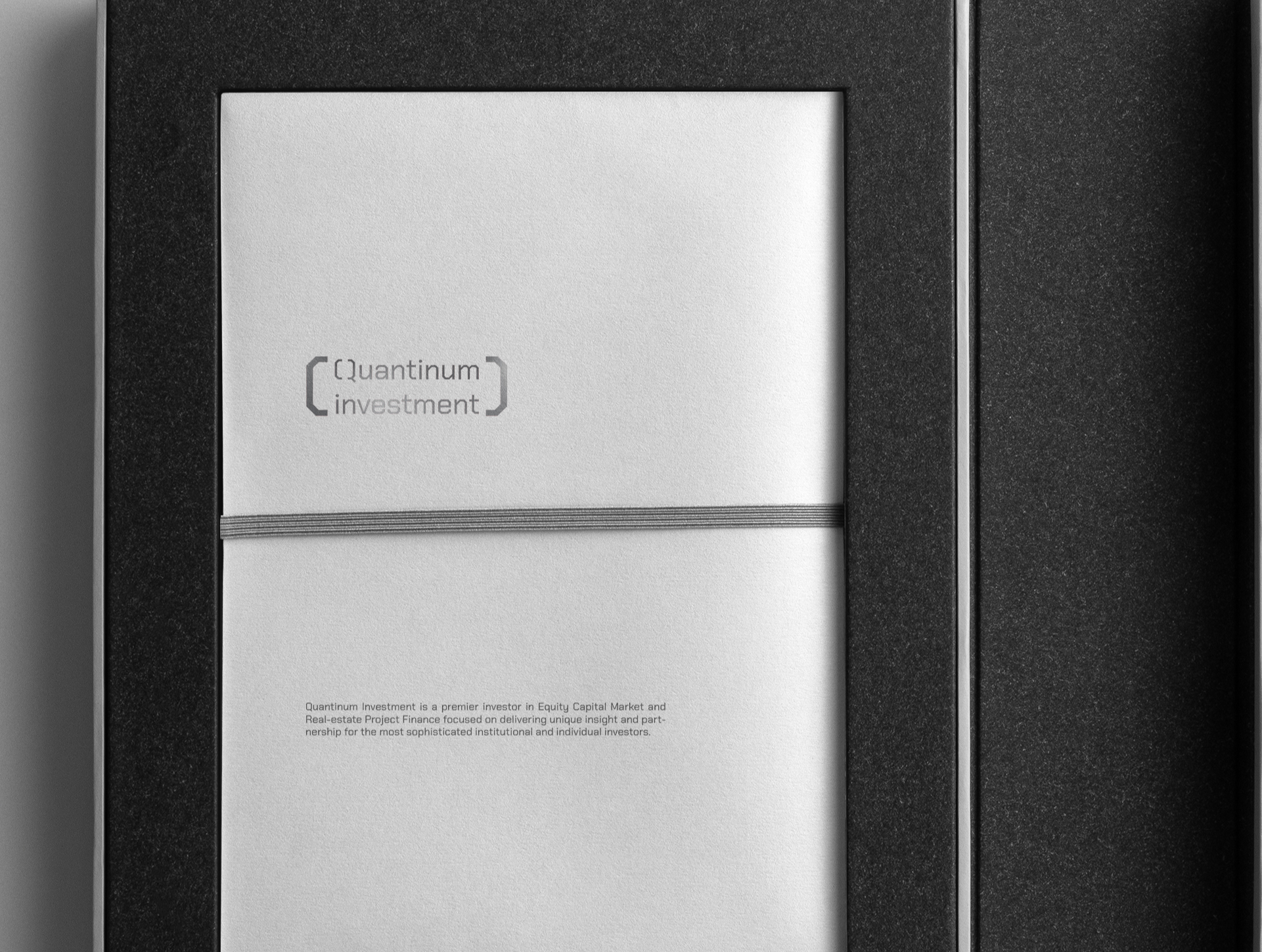
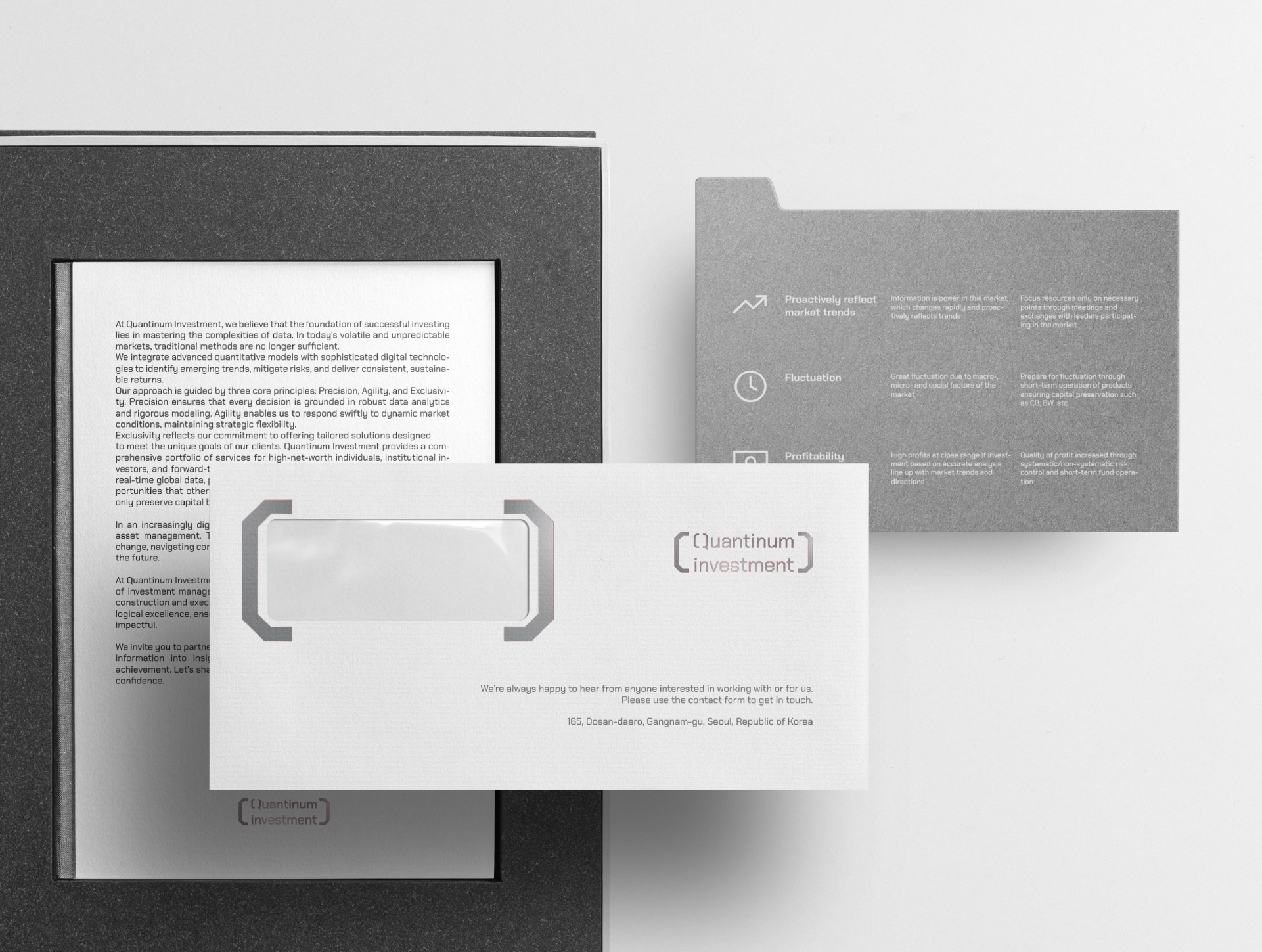
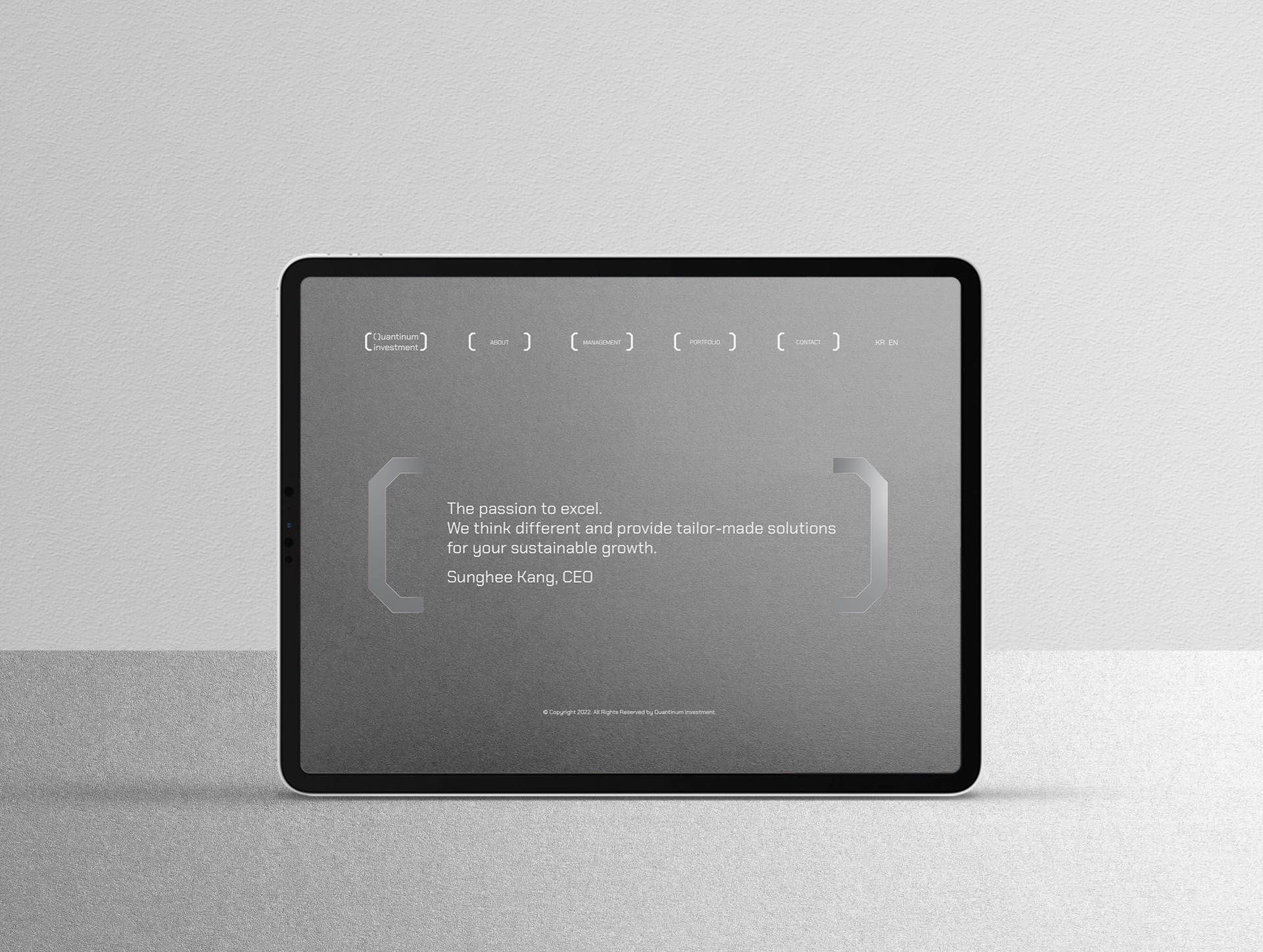
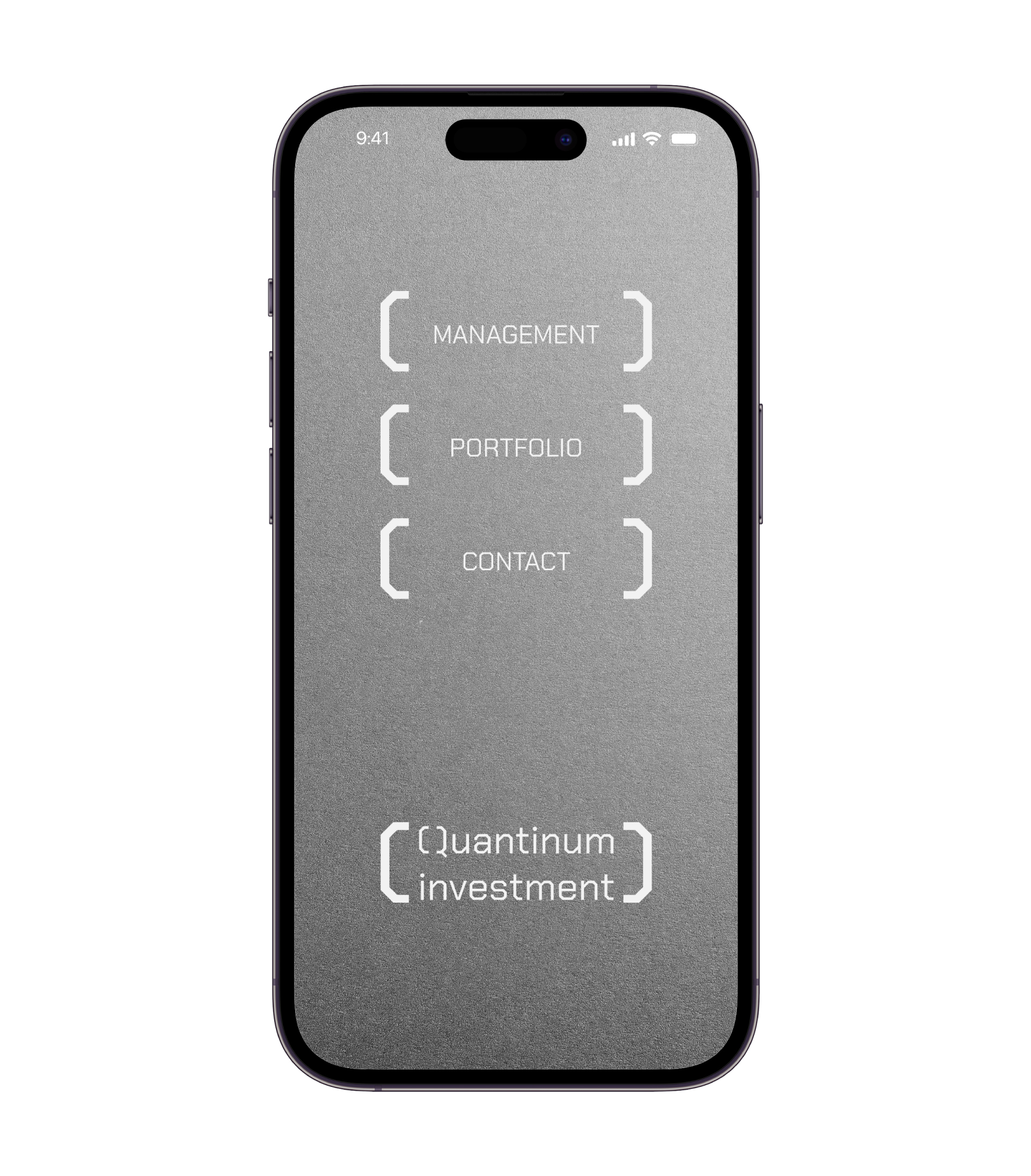
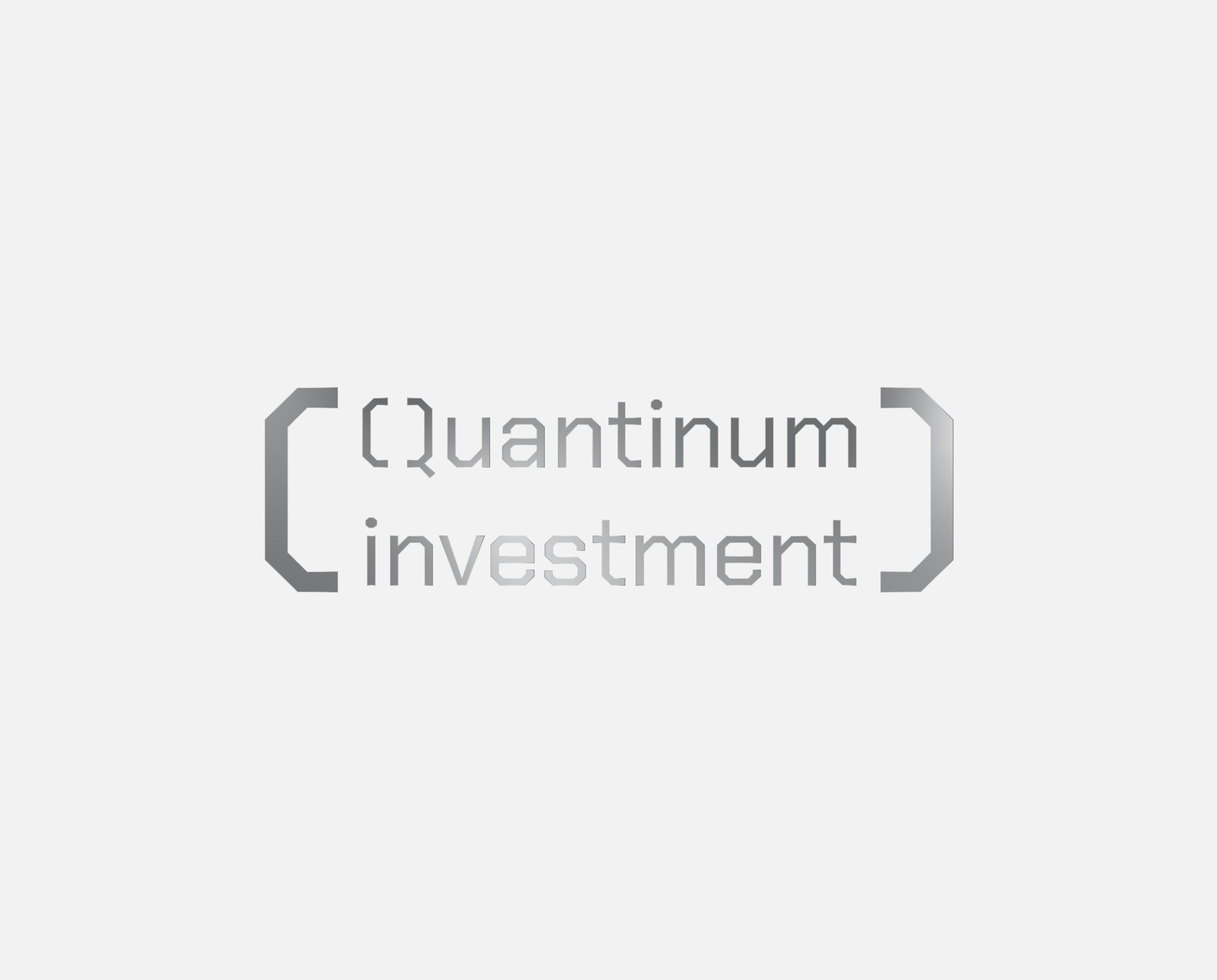
To visually represent Quantinum Investment’s data-driven mindset, we utilized angular brackets reminiscent of digital signals as a key design element. The initial “Q” was structurally reinterpreted to symbolize precision and systematic thinking. By adding a platinum texture, we conveyed rarity and premium value. The color palette-platinum, cool gray, and white-further reinforced a digital, modern impression.
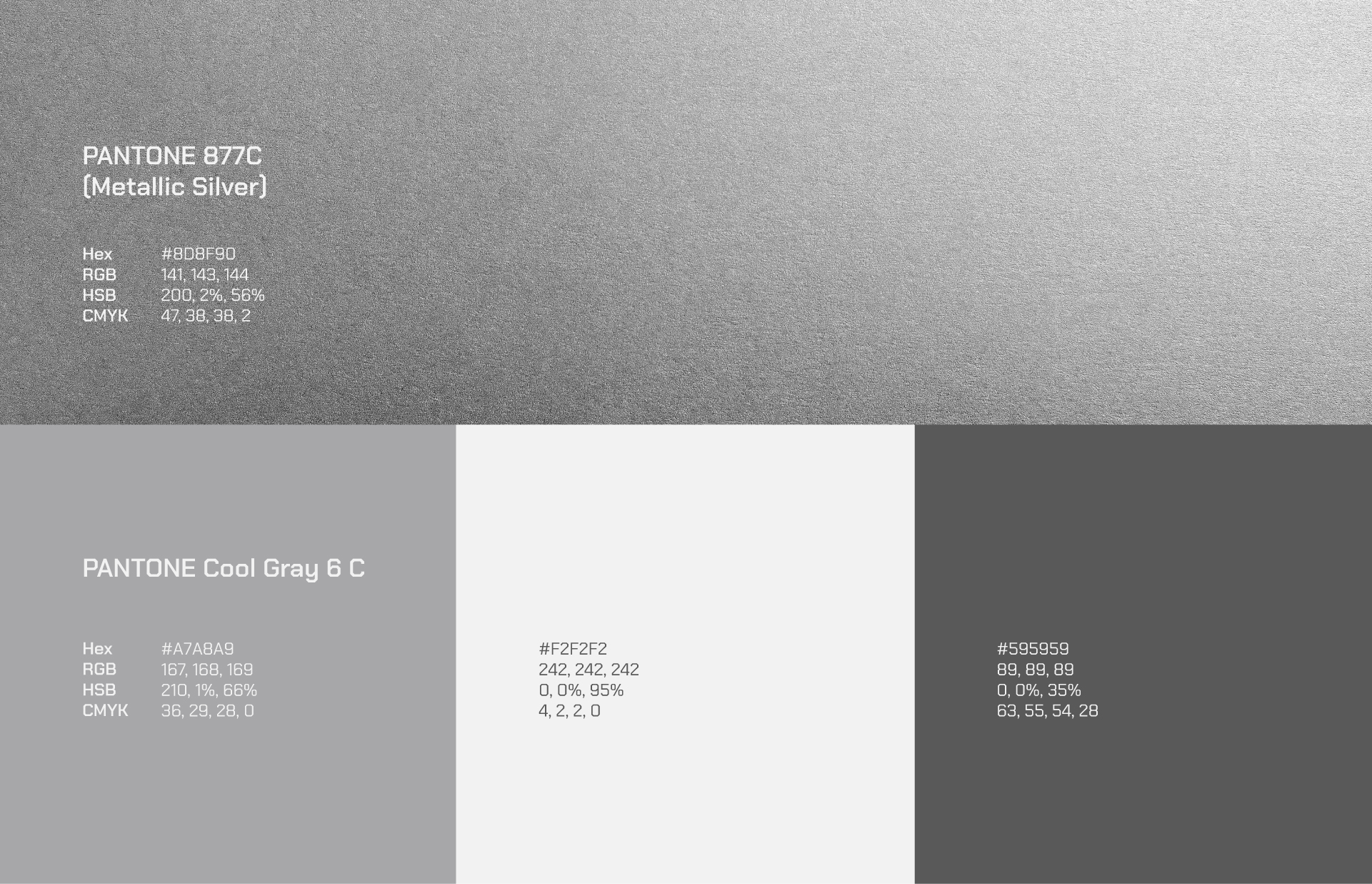
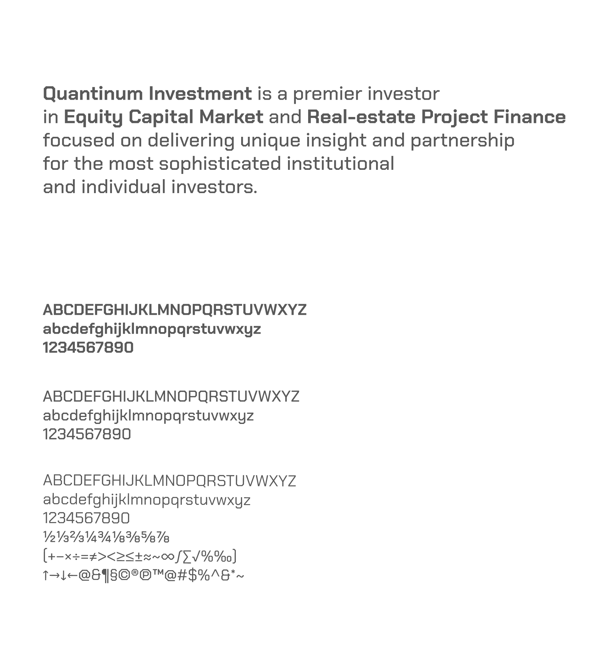
Quantinum Investment’s visual system is built on the following elements. The primary mark is a stylized “Q,” crafted from digital brackets. The color palette centers around Platinum, Cool gray, and White. Typography is based on a geometric sans-serif style, emphasizing precision and modernity. The overall visual tone reflects precision, modernity, and exclusivity.
The new visual identity for Quantinum Investment clearly communicates its data-driven approach and premium value. It strengthens the brand’s credibility and differentiation, securing a distinctive position in the next-generation investment market.
